Backstory
nVision is an in-house one stop shop enabling consumption of business performance reports across domains of AMEX. It consolidates reporting across multiple BI tools and provides a single-interface unified report distribution and alerting platform.
nVision Admin Panel is like the control centre. This is where admins and report producers manage all the data, ensuring everything runs smoothly.
But Why Redesign?
Challenges including cumbersome navigation, excessive clicks, overwhelming information, and a non-intuitive design that hampers efficiency for admins and report uploaders. These issues result in wasted man-hours onboarding users, frequent doubts, and unclear workflows, highlighting the need for a streamlined and intuitive redesign.
“ How might we streamline workflows like updating metadata, creating reports, and managing dashboards to minimise the time product owners spend guiding nVision users? ”
My Approach
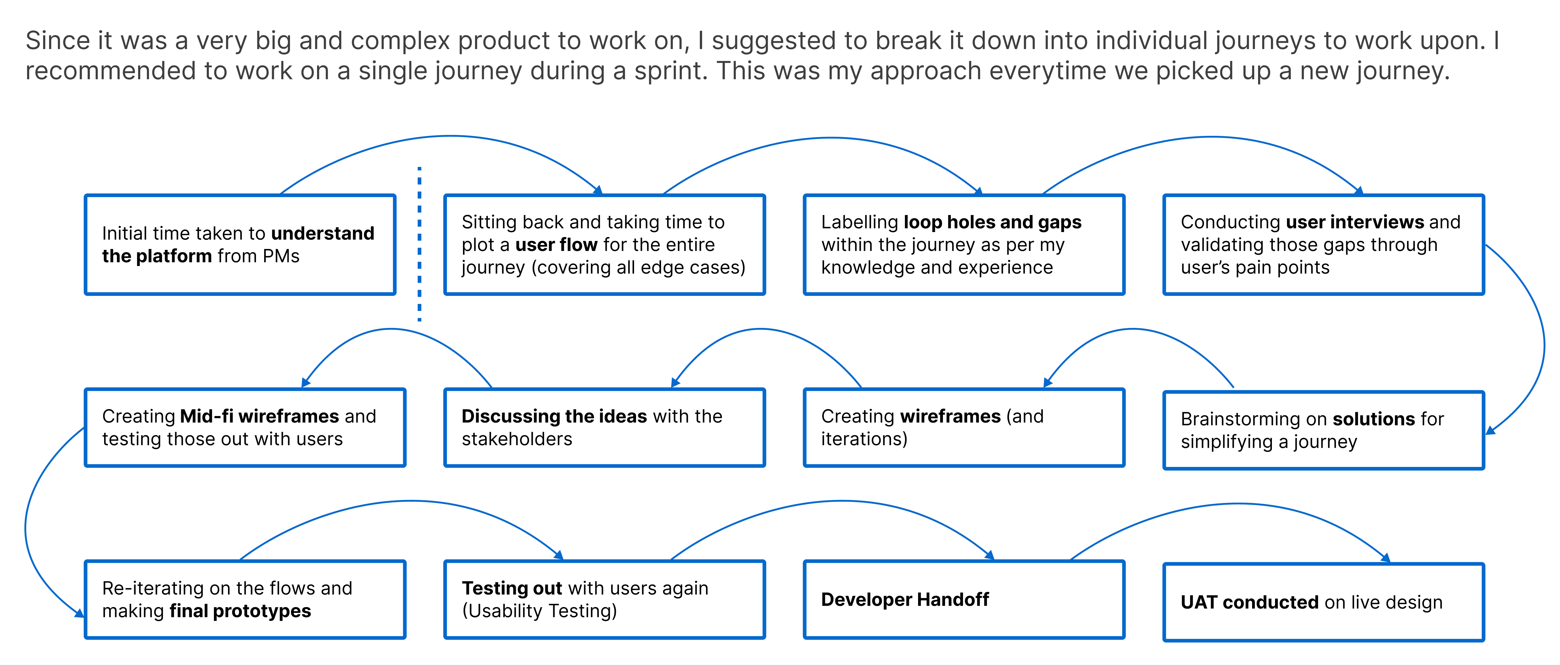
Existing Platform and Journeys
I broke down all the major journeys into very superficial flows so that I understand the scope of work in place. This also helped me look at the individual journeys from a functional perspective.

From these journeys I started to understand patterns as to where the potential problem would lie.
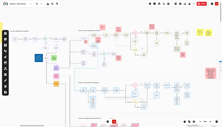
In order to study all the journeys in more depth, I came up with the detailed flow for each journey as follows (snapshot from my Mural Board)
I started to plot out pain points as per my understanding. These could be termed as “hypothesis”. (As per the picture in red stickies)
Research
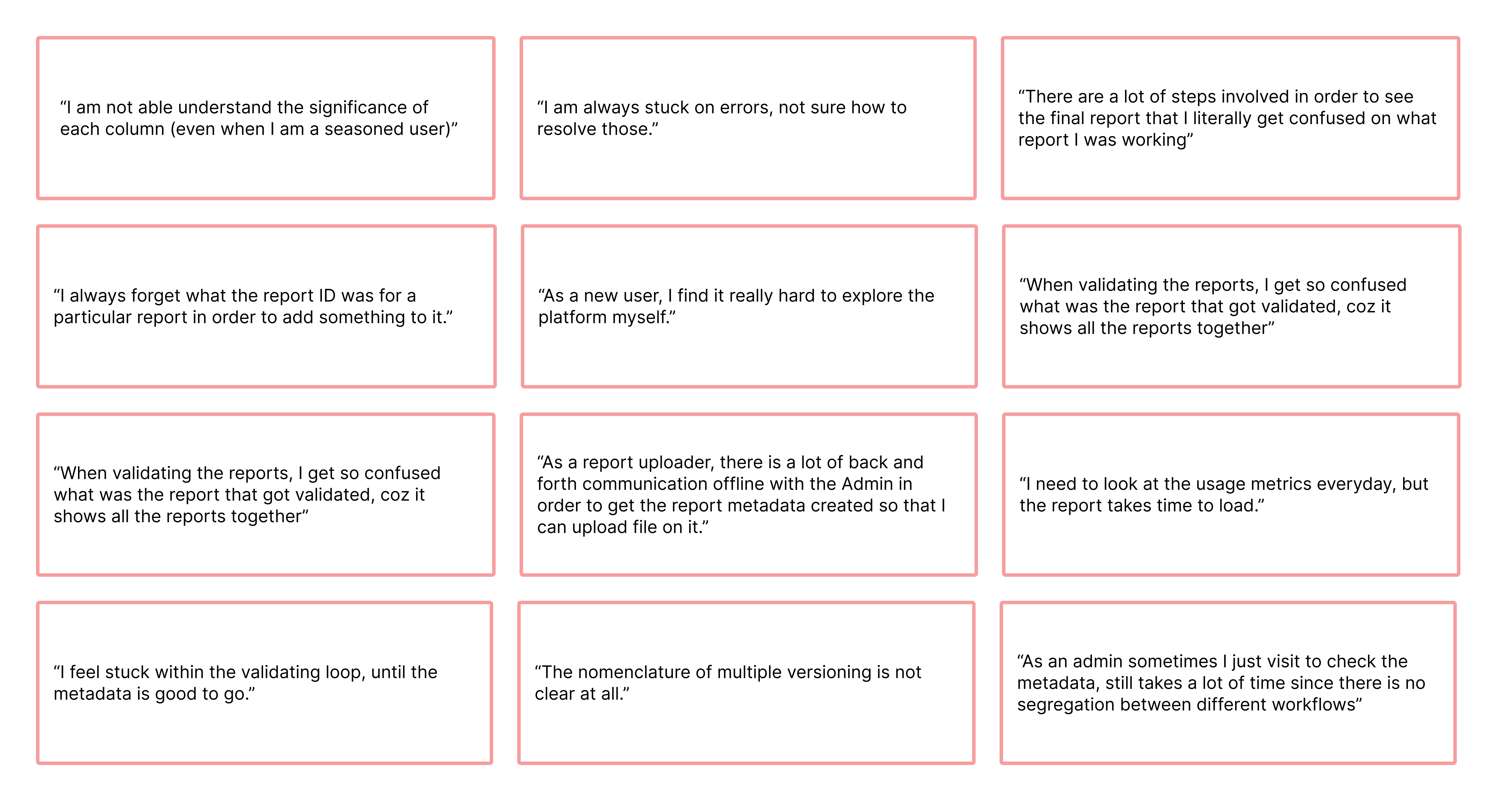
It was not easy to arrive at the final solution. I began with procuring a list of users both Admin (these have the option to perform all the tasks and functions within the admin panel) and Report Uploaders (these people have the option of only uploading data files to the reports created by admins).
For the scope of this case study, following were the pain points that admins were facing while using the nVision admin panel:
There were additional pain points for the journeys. I tallied them with the initial loop holes that I had plotted within the user flow diagram. Thus all ny hypothesis got verified.
Improved Information Architecture
Here is the new IA that I devised on the basis of inputs that I got during research. The key difference to note is that the new IA has all the journeys initiated from the Control Panel. As per this flow, the user no longer need to recall the Report unique key for each and every report in order to proceed with the flow. (Can talk more about the decisions taken to come up with this IA.)

Scope of this Case Study
Since this was a large project, with over 11 journeys to work on, for the sake of this case study I am only focusing on the following:
1. Overall Dashboard Design.
Create New Report (This is a brand new journey proposed by me.)
Update Metadata
User Flow
Here is a straight forward comparison between the old flow and the new flow. I have also plotted out the pain points (on the older flow) and the subsequent steps taken (within the new flow) to solve these.
Brainstorming
I obviously did a lot of brainstorming session. Here are some snippets from the process. I also worked on a lot of iterations in order to reach the final designs.


UX Design | UI Design | Prototyping
Redesigning American Express Enterprise Experience
The improved design and streamlined user journeys made the platform more intuitive, saving manpower hours by over 75%
DesignStrategy
DesignStrategy
User Experience Design
User Experience Design
User Research
User Research
UI Design
UI Design
Created for
American Express
Timeline
6-8 months
Collaborated with
Product Managers, Developers and Leadership
Product Managers,
Developers and Leadership
Backstory
nVision is an in-house one stop shop enabling consumption of business performance reports across domains of AMEX. It consolidates reporting across multiple BI tools and provides a single-interface unified report distribution and alerting platform.
nVision Admin Panel is like the control centre. This is where admins and report producers manage all the data, ensuring everything runs smoothly.
But Why Redesign?
Challenges including cumbersome navigation, excessive clicks, overwhelming information, and a non-intuitive design that hampers efficiency for admins and report uploaders. These issues result in wasted man-hours onboarding users, frequent doubts, and unclear workflows, highlighting the need for a streamlined and intuitive redesign.
“ How might we streamline workflows like updating metadata, creating reports, and managing dashboards to minimise the time product owners spend guiding nVision users? ”
My Approach
Existing Platform and Journeys
I broke down all the major journeys into very superficial flows so that I understand the scope of work in place. This also helped me look at the individual journeys from a functional perspective.
From these journeys I started to understand patterns as to where the potential problem would lie.
In order to study all the journeys in more depth, I came up with the detailed flow for each journey as follows (snapshot from my Mural Board)
I started to plot out pain points as per my understanding. These could be termed as “hypothesis”. (As per the picture in red stickies)
Research
It was not easy to arrive at the final solution. I began with procuring a list of users both Admin (these have the option to perform all the tasks and functions within the admin panel) and Report Uploaders (these people have the option of only uploading data files to the reports created by admins).
For the scope of this case study, following were the pain points that admins were facing while using the nVision admin panel:
There were additional pain points for the journeys. I tallied them with the initial loop holes that I had plotted within the user flow diagram. Thus all ny hypothesis got verified.
Improved Information Architecture
Here is the new IA that I devised on the basis of inputs that I got during research. The key difference to note is that the new IA has all the journeys initiated from the Control Panel. As per this flow, the user no longer need to recall the Report unique key for each and every report in order to proceed with the flow. (Can talk more about the decisions taken to come up with this IA.)
Scope of this Case Study
Since this was a large project, with over 11 journeys to work on, for the sake of this case study I am only focusing on the following:
1. Overall Dashboard Design.
Create New Report (This is a brand new journey proposed by me.)
Update Metadata
User Flow
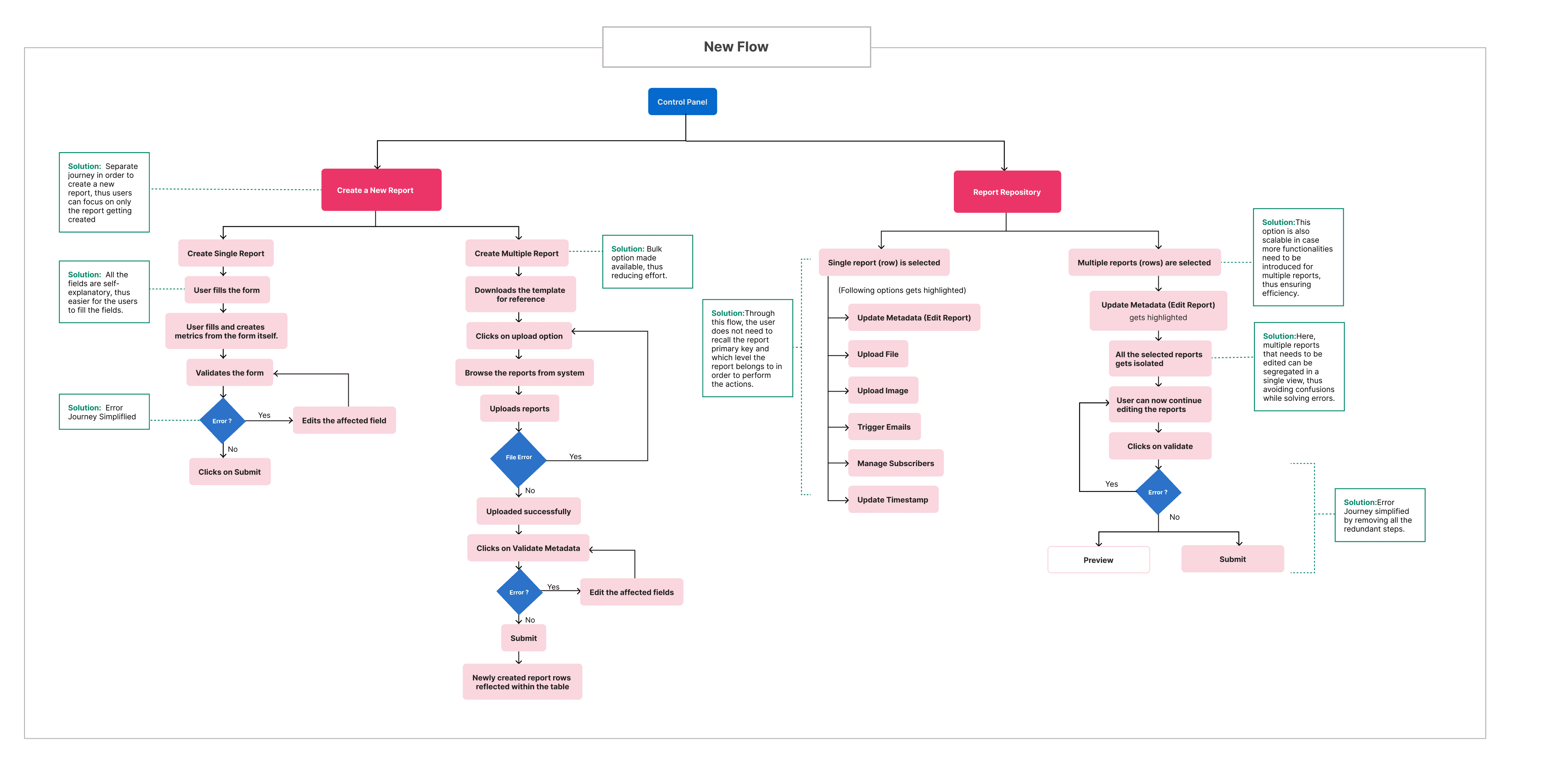
Old Flow
Control Panel
Create a New Report
( User clicks on ‘+’ or ‘
‘)
User selects ‘Space Page Metadata’ from the Feed Type
The Reports Repository table gets displayed
+ or
Blank row gets added
Fills the values
Clicks on validate
Submit
Finalise
Preview
No
Yes
Error ?
A copy of the existing
report (row) is made
Edit Metadata
(Click on a particular row)
Starts editing the row content
Clicks on validate
Submit
Finalise
Preview
Error ?
Problem: No option to create multiple reports at a time
Problem: Redundant Steps
Problem: Columns not self-explanatory, less context exists.
Problem: The complete table gets
executed together,
thus difficult to track which
row was being worked upon.
Problem: Users felt that the error journey was not at all intuitive.
Brainstorming
I obviously did a lot of brainstorming session. Here are some snippets from the process. I also worked on a lot of iterations in order to reach the final designs.
Solution
New nVision Dashboard

Key Features:
Key metrics displayed upfront from the nVision usage dashboard.
All the report modification options activates on selection of a particular report from the table.
'New journey of creating a new report introduced in order to isolate the report creation process'
Update Metadata Journey
Users have a better overview of the complete dashboard.
Admins can have a look at the major key insights of the report performance at a glance (Metrics displayed above).
The error journey is more intuitive now. Inline error editing functionality was well received by the users.
The approach of selecting reports and then performing actions is a new approach taken and would help the users to focus on that particular report.
The approach of straightaway validating and finalising the report, felt way better than the confusing approach before.
Create New Report
The user can browse and select multiple reports in order to upload within the space page dashboard
The errors get displayed in case there are any problems while uploading the reports on the dashboard.
The user can now edit the cells within the table in case of any errors (red) or warnings (yellow).
This allows user to create reports in bulk at a time.
Impact
The redesign of the nVision Admin Panel significantly improved workflow efficiency, reducing the dependency on Product Owners for routine queries.
By streamlining report uploads and administrative tasks, the new system enhanced self-sufficiency, allowing users to complete their work with minimal friction.
This transformation had a measurable impact on American Express, cutting man-hours by 75%, leading to substantial operational cost savings.
The reduction in redundant back-and-forth communication freed up valuable time for admins, report uploaders, and Product Owners, enabling them to focus on higher-value tasks.
This efficiency boost not only accelerated decision-making but also enhanced overall productivity across teams, reinforcing the company’s commitment to seamless internal operations and digital transformation.
What is nVision?
nVision is an in-house one stop shop enabling consumption of business performance reports across domains of AMEX. It consolidates reporting across multiple BI tools and provides a single-interface unified report distribution and alerting platform.
nVision Admin Panel is like the control centre. This is where admins and report producers manage all the data, ensuring everything runs smoothly.
But Why Redesign?
Challenges including cumbersome navigation, excessive clicks, overwhelming information, and a non-intuitive design that hampers efficiency for admins and report uploaders. These issues result in wasted man-hours onboarding users, frequent doubts, and unclear workflows, highlighting the need for a streamlined and intuitive redesign.
“ How might we streamline workflows like updating metadata, creating reports, and managing dashboards to minimise the time product owners spend guiding nVision users? ”
My Approach
Existing Platform and Journeys
I broke down all the major journeys into very superficial flows so that I understand the scope of work in place. This also helped me look at the individual journeys from a functional perspective.
From these journeys I started to understand patterns as to where the potential problem would lie.
In order to study all the journeys in more depth, I came up with the detailed flow for each journey as follows (snapshot from my Mural Board)
I started to plot out pain points as per my understanding. These could be termed as “hypothesis”. (As per the picture in red stickies)
Research
It was not easy to arrive at the final solution. I began with procuring a list of users both Admin (these have the option to perform all the tasks and functions within the admin panel) and Report Uploaders (these people have the option of only uploading data files to the reports created by admins).
For the scope of this case study, following were the pain points that admins were facing while using the nVision admin panel:
There were additional pain points for the journeys. I tallied them with the initial loop holes that I had plotted within the user flow diagram. Thus all ny hypothesis got verified.
Improved Information Architecture
Here is the new IA that I devised on the basis of inputs that I got during research. The key difference to note is that the new IA has all the journeys initiated from the Control Panel. As per this flow, the user no longer need to recall the Report unique key for each and every report in order to proceed with the flow. (Can talk more about the decisions taken to come up with this IA.)
Scope of this Case Study
Since this was a large project, with over 11 journeys to work on, for the sake of this case study I am only focusing on the following:
1. Overall Dashboard Design.
Create New Report (This is a brand new journey proposed by me.)
Update Metadata
User Flow
Old Flow
Control Panel
Create a New Report
( User clicks on ‘+’ or ‘
‘)
User selects ‘Space Page Metadata’ from the Feed Type
The Reports Repository table gets displayed
+ or
Blank row gets added
Fills the values
Clicks on validate
Submit
Finalise
Preview
No
Yes
Error ?
A copy of the existing
report (row) is made
Edit Metadata
(Click on a particular row)
Starts editing the row content
Clicks on validate
Submit
Finalise
Preview
Error ?
Problem: No option to create multiple reports at a time
Problem: Redundant Steps
Problem: Columns not self-explanatory, less context exists.
Problem: The complete table gets
executed together,
thus difficult to track which
row was being worked upon.
Problem: Users felt that the error journey was not at all intuitive.
Here is a straight forward comparison between the old flow and the new flow. I have also plotted out the pain points (on the older flow) and the subsequent steps taken (within the new flow) to solve these.
Brainstorming
I obviously did a lot of brainstorming session. Here are some snippets from the process. I also worked on a lot of iterations in order to reach the final designs.
Solution
New nVision Dashboard
Key Features:
Key metrics displayed upfront from the nVision usage dashboard.
All the report modification options activates on selection of a particular report from the table.
'New journey of creating a new report introduced in order to isolate the report creation process'
Update Metadata Journey
Users have a better overview of the complete dashboard.
Admins can have a look at the major key insights of the report performance at a glance (Metrics displayed above).
The error journey is more intuitive now. Inline error editing functionality was well received by the users.
The approach of selecting reports and then performing actions is a new approach taken and would help the users to focus on that particular report.
The approach of straightaway validating and finalising the report, felt way better than the confusing approach before.
Create New Report
The user can browse and select multiple reports in order to upload within the space page dashboard
The errors get displayed in case there are any problems while uploading the reports on the dashboard.
The user can now edit the cells within the table in case of any errors (red) or warnings (yellow).
This allows user to create reports in bulk at a time.
Impact
The redesign of the nVision Admin Panel significantly improved workflow efficiency, reducing the dependency on Product Owners for routine queries.
By streamlining report uploads and administrative tasks, the new system enhanced self-sufficiency, allowing users to complete their work with minimal friction.
This transformation had a measurable impact on American Express, cutting man-hours by 75%, leading to substantial operational cost savings.
The reduction in redundant back-and-forth communication freed up valuable time for admins, report uploaders, and Product Owners, enabling them to focus on higher-value tasks.
This efficiency boost not only accelerated decision-making but also enhanced overall productivity across teams, reinforcing the company’s commitment to seamless internal operations and digital transformation.
Copyright 2025 by Upasna Sharma
Copyright 2025 by Upasna Sharma
Redesigning American Express Enterprise Experience
The improved design and streamlined user journeys made the platform more intuitive, saving manpower hours by over 75%
DesignStrategy
DesignStrategy
User Experience Design
User Experience Design
User Research
User Research
UI Design
UI Design
Created for
American Express
Timeline
6-8 months
Collaborated with
Product Managers,
Developers and Leadership